MY BLOG

MONOPRINTS

Techniques and Materials

Earlier this year I spent a couple of months in Ireland......   with 3,500 miles travelled you can imagine the wealth of reference I came home with.  I kept a journal packed with drawings, photos and words about the folk met along the way and details of each days happenings, the weather, history, atmosphere and anecdotes.  I find having all of this infomation helps when trying to recreate images when I get back to the studio.  More details of the travels can be seen on Ramsgill Studio Facebook Page.


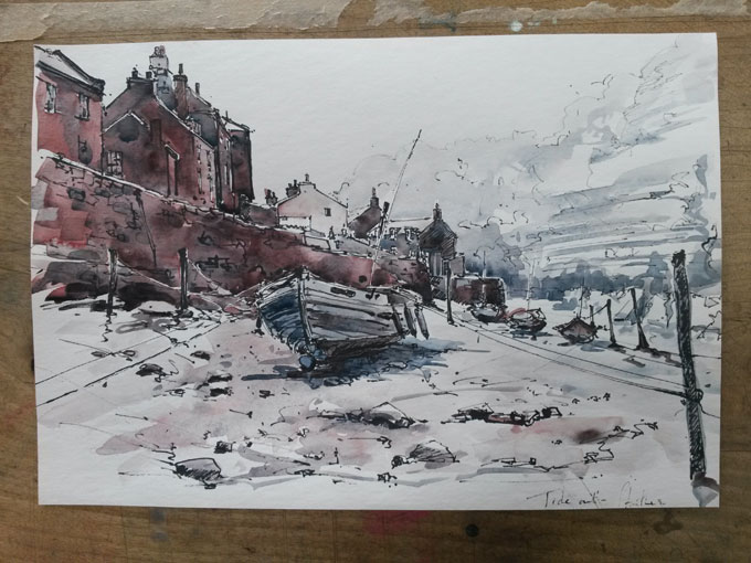
I decided to depict the landscape and coastal scenes in oils and the stone circles, ruined castles, skeleton boats and megalithic tombs in drawings in the form of monoprints.  I've been looking forward to doing these since getting back....  drawing for me is inate, like improvisation, I let my hand take over, making marks and exploring the surface.


Monoprints by their very nature are immediate and spontaneous, they can be created in just a few minutes and are a one off.  In their simplest form they are created by lying a thin piece of paper over an inked up surface and by applying pressure to the reverse of the paper an image is created.  Their beauty is in the balance of the tones and the variety of mark making creating a quality of line that is not achievable by direct drawing.  By working in reverse they can be a bit hit and miss but by experimenting and playing with different materials and mark making impliments you can take some of the 'miss' out of it!

Having said this, once the basics are mastered monoprints can be taken onto a different level by intoducing coloured inks, handmade papers and gold leaf.  They can be quite planned and considered although the end result can still be a bit of a mystery.  The following notes are my take on monoprints, the materials I use and how I go about making a fairly complex print.

Monoprint-materials

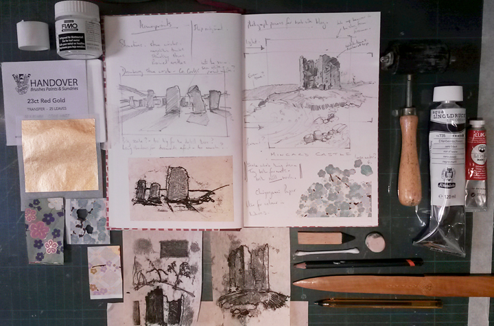
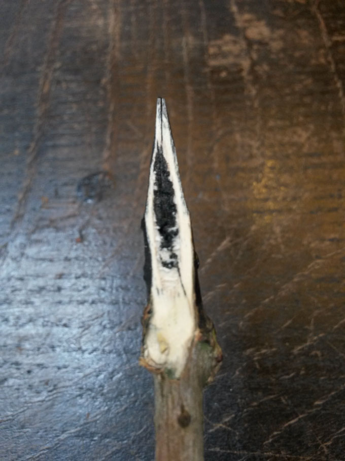
This photo shows a variety of mark making tools from a cotton bud for soft lines to a piece of balsa wood for square edged marks.  I use Schmincke Aqua Linoprint inks, Japanese Gampi Vellum 32g and beautiful Chiyogami screen printed papers from Shepherds of London www.store.bookbinding.co.uk Handover gold leaf, and plexiglass as a plate. The thinner the paper the more responsive to pressure it is.... cheap newsprint works well, but some of the plant based Japanese papers are stunning once you gain confidence.  I use Staedtler size for leaf metal for the gold leaf as it doeasn't seem to soak into the paper as much as proper size for gold leaf.  

I tab the piece of paper onto the plexiglass with micropore tape, a thin medical paper tape which is less tacky than normal masking tape, so as not to tear the delicate paper.  I plot out the area to be printed and mask round the edges with tape.  Squeeze out a little ink at a time, you will be suprised how little you need to roll out a very thin film.  Excess can be removed by gently lying a piece of tissue over the top.

Monoprints-inking-up

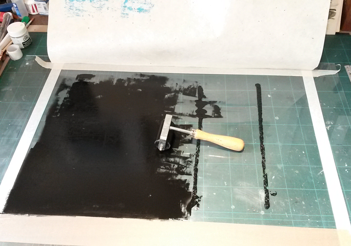
This photo shows the paper tabed at the top..... it alows you to flip the piece of paper up to check on progress.  One of the hardest things to gauge is the amount of ink on the plate in relation to how much pressure is needed to get a mid tone coverage especially bearing in mind as soon as it is rolled out it starts to dry!  By drawing crop lines on the plexiglass you can successfully re ink the plate if needed.

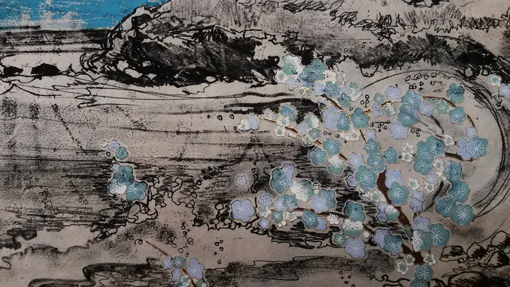
I started this piece by cutting out a blossom pattern from a gorgeous Chiyogami printed paper, taking hours but very effective.  The patterend paper was stuck on the right side of the print to suggest the foam and spray of the waves on the beach.  On a lightbox I traced around the position of the paper so I could incorporate it accurately into the print.  With my reference picture flipped in reverse I loosely plotted out where the image was going to be, trying to leave as little to chance as possible.  The photo below shows this stage although it's quite hard to see.Monoprint-reverse

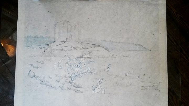
On this print I chose to print the background distant hill in turqoise in the hope that the colour would tie in with the colour in the patterned foreground paper.  As it happened it didn't work very well!  I then started with the sky area, applying pressure just with my hand to create a soft cloud like effect, being carefull to stop short of the castle so it appears to have a light halo around it.  I continued down finishing with some detail in the stones and surface of the water.  The photo below shows a detail of the finished image.  The image as a whole was interesting although the focal point of the castle filled in a bit too much, loosing the detail in the brickwork.

Mineard-Castle-Detail


The complete image can be seen under the monoprint section in 'New Work'.

Drawing Techniques and Sketchbooks

Part One


I'm a huge fan of drawing and sketchbook work.  My sketchbooks are memory books as much as working ideas in progress and especially whilst gathering reference abroad they are absolutely invaluble.  The techniques for drawing and sketching are endless, but here are just a few.

Recently I've been going back to pen and ink drawing using a hand fashioned pen made from an Elder stick.  I find Elder works well as it has a soft pulpy centre which when hollowed out holds the ink very well.  Using a very sharp scalple  shave off the top and bottom of the stick up to about 1.5 inches.  Then gradually start trimming in the sides till you get the width of nib required. Carefully cut a slit from the point about half an inch to connect with the soft pulpy part.  When I have more time I'll post a video, it might be easier!  Here is a photo of one I've made.


The above image of Staithes was drawn using this.  Its amazing how long the ink will flow just with one dip into the ink.  You can use it on it's edge for finer lines, and when the ink starts to run out do your background lines so they are lighter and more sketchy. Sometimes they blob a bit but it's the nature of the medium and adds character to the image.  The above picture was then coloured in using just two Daniel Smith colours. Daniel Smith is an American make of watercolour.  Quite a few colours are not traditional in the sence that they have combined pigments in the same tube so as they dry and separate you get some lovely quirky results.  The two colours used in this were Piemontite Genuine and Blue Apatite Genuine.


I've also found that the softness of pencils really differ from make to make. For instance if I'm drawing out for a watercolour and don't want too much of a line I've been using a Faber Castel 2B..... but if I want to do a good tonal pencil drawing I've been using a Berol Turqoise 2B which gives great tonal variation, even quite dark shaded areas can be worked back into... I love detail in the shadows.


I've started going to a life drawing class at Old Sleningford near Ripon where Anna Poulton and Stuart Whitehead alternate tutoring. It's just 7.30 - 9.30 so not too daunting if you are new to it.  I've done a bit over the years but its certainly not my forte!  They come up with great ideas to make you think out of the box and tends to be more technique based rather than drawing a perfectly proportioned figure.  The image above was part of a larger one experimenting with a water wash compined with compressed charcoal... some charcoal is better than others so it was a bit trial and error, but once wet you can really move it about, then wait to dry and work back into it.  We also did a couple of poses on the same page creating an interesting juxtpostion bewtween the two.


This exercise was using white chalk to plot a very quick shape, only about 20 seconds, on a set of four poses. The model then repeated the same poses and we added a little more detail. It was used as a warm up.


If you want to get more tips on some of my recent pieces look at Ramsgill Studio Facebook page where I regularly post pictures and tips…..


Nearly forgot…..  something I just discovered, worth its weight in gold, if you have mixed a sets of colors in oils and don't have time to use all the paint and need to keep it, just pop it in the freezer, its ready to use again almost as soon as you bring it out….. magic!

Welcome to my New Website!

New Developing Work

Welcome to my New Website!

It's been an all round busy time with the building of the new website, numerous exhibitions looming and some interesting developments with my work.

I've been painting on gesso boards for some time, scumbling a background and sketching out the image with a brush before covering the board with the image.  I often scumble with a warm colour, usually ochre and light red with some white and glaze medium, and sketch out using a purple/brown so that there is an interesting quality to it before starting.  I think this is just a psychological process as most of it is covered up.

This has led me onto developing my sketch book work directly into paintings rather than using photos.  Its quite a hard process I think to rely completely on the sketches, but often the pencil sketches/doodles have more life to them than the finished paintings, so I've been trying to harbour this, build on it, and transfer it back into the finished painting.  I've always found my drawing more innate than painting.... its a hard one to describe, almost as if my eyes see something and it comes out through my hand.  With painting there is a middle stage of consciously interpreting what I can see.

The surface texture of the primed boards has become much more important, an integral part of the finished piece.  On the last layer of gesso I gently drag a wide brush over the surfce which creates an almost bark like effect. I've been using a pale blue/turqoise as well as the previous warm colours to scumble the board, and am still learning as to what stage to remove the paint and add another layer. It gives a lovely textural interest....  I'm just about to scale this up to a 70cm square board, the previous ones have been 30cm square, but I'm not sure on a bigger scale if I will need to consider the image to go onto the board whilst creating the background, on the smaller ones I haven't.


The resulting painting from these notes can be seen under Gallery 3 titled Silver Birch Wood near Danby.

North Yorkshire Open Studios

This is my first year to be involved in North Yorkshire Open Studios... there is a link to their website on my exhibition page.  Its a very exciting event with 126 artists taking part right across the region from Settle in the west over to the east coast.  I'm moving a collection of my work to Number 6 Studio in Pateley Bridge to save you all the drive up the dale!  I'm looking forward to seeing it hung in an uncluttered space.

The show is over two weekends the 7/8 June and 14/15 June....  here is an invite to the preview on Friday 6th.... everybody is welcome.

A Walk on the Wild Side!…….

A Walk on the Wild Side!…….

All my paintings start with a walk with my dog Pepper.  I often discuss with her at great length the ins and outs of the paintings that will result from it...   she is very knowledgeable, if only she could paint!

Here are a couple of photos from a recent walk.... usually I'm not keen on filters/effects on cameras, but my little compact Lumix has an effect called Impressive Art on it which is quite quirky..... used on this tree out of a rock photo.


Talking of impressive, the bluebells have been stunning this year, here is a shot taken a few weeks ago at a little place called Eaveston on the Ripon Rowel path.  I'll be doing some more paintings including bluebells so I'll include a few notes on colour mixing, they are quite tricky!